
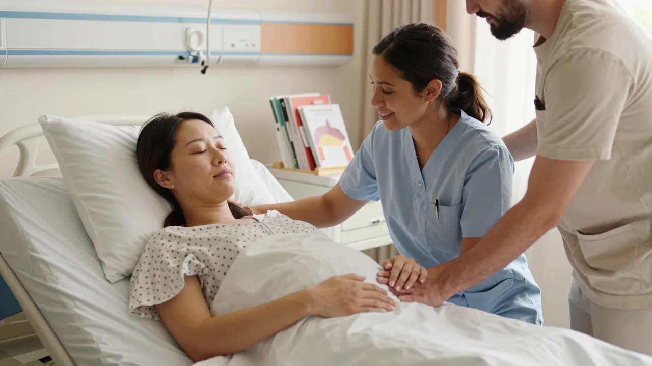
You’ve poured everything into your doula practice. The evidence, the empathy, the hands-on experience, it’s all there. But then you drop off that glossy brochure at the local hospital’s labor ward, and it lands in a pile with fifty others. They’re all shouting for the same exhausted, overwhelmed parents. You check your website stats, but the phone stays silent. Here’s the hard truth: your brochure isn’t building a bridge to your services. It’s just another sheet of paper headed for the recycling bin.
The frustrating part is knowing you’re the right doula for those families. In the high-stakes chaos of a labor ward, though, you’ve got roughly seven seconds to catch someone’s eye. An exhausted partner doesn’t have time for blocky text or generic stock photos. Frankly, that won’t cut it in 2026. What you need is something that feels like a calm hand on a sweaty forehead. Immediate. Reassuring. Impossible to ignore. That’s exactly why we built the Doula Masterclass. Our goal is to hand you an evidence-based design framework that turns a boring handout into a referral magnet people trust.
You can skip the graphic design degree and the big budget. What you really need is to quit guessing. Use the same psychological triggers and visual shortcuts that top-tier birth professionals rely on to keep their calendars full. In this guide, we’re pulling back the curtain on the good stuff. We’ll cover font choices that quietly signal safety, plus layout tricks that make your contact information almost impossible to misplace. Ready to create a brochure that people actually hold onto? Let’s redesign your success story.

In 2026, labor ward brochures have a bigger job than simply informing. They need to emotionally guide expectant parents through a decision that feels incredibly high-stakes and anxiety-ridden.
The old days of a stapled photocopy with clip-art and a bullet list of visiting hours are long gone. By 2026, parents show up at the labor ward already overwhelmed. They have read the forums, watched the birth vlogs, and heard the horror stories from their aunt’s cousin. Your brochure is not just a handout. It is a handhold. When their heart is racing and questions are swirling, it might be the first tangible thing they grip. So design it like you are sitting beside them, not lecturing them. Every single page should feel calm, clear, and compassionate.
For doulas in the Doula Masterclass, this is your chance to connect clinical policy with human experience. An effective brochure doesn’t simply list “pain management options.” Instead, it whispers, “You have choices, and we’ll help you find what feels right.” It doesn’t just say “call your provider if you have concerns.” It shows a warm photo of a nurse’s face and a direct line. The goal is to reduce cognitive load, not add to it. Every word should answer an unspoken fear, and every image should say, “You are safe here.”
The 2026 Shift: From Information Dump to Emotional GPS
Think of your brochure as an emotional GPS. It gives directions, sure, but it also reassures you that you are on the right road. That means ditching dense paragraphs and treating white space like the luxury item it actually is. For a laboring brain, white space is pure gold.
- Lead with a story, not a policy. Open with a short, real quote from a parent who delivered there. Something like, “I was terrified, but the moment I walked in, I felt seen.” That lands harder than any mission statement ever will.
- Use “you” language. Say “You’ll be greeted by a nurse within 15 minutes,” not “Patients are greeted.” It is personal and immediate. It tells their brain, This is about me.
- Answer the unasked question. Under every section, add a tiny FAQ box with the question you know they are too shy to ask: “Can my partner eat in the room?” “What if I poop during pushing?” Normalize the messy, human parts. That builds trust faster than any credential.
Visual Design That Lowers Cortisol
Your layout does emotional work before anyone reads a single word. In 2026, clean, soft, and human beats clinical and crowded. No contest.
- Ditch the stock-photo grimace. You know the one, the model smiling through a fake contraction. Use real photos of your actual staff and real birth spaces instead. Blurry is fine. Authentic is better.
- Color psychology matters. Soft blues, sage greens, and warm creams signal safety. Harsh reds and stark whites scream “hospital,” not “haven.” Avoid them.
- Make it scannable in 30 seconds. Use bold subheadings, numbered steps, and icon-based graphics. A laboring partner should not have to hunt for “when to call the doctor.” It should sit in a giant box at the top of page two.
A Clear Call to Action (That Isn’t a Boring URL)
Every brochure needs a next step. In 2026, that next step should feel like an invitation, not a task. So skip the plain “www.ourhospital.com.” Give them a QR code that leads to a short, soothing video tour of the ward. Set it to calm music, and have a nurse explain what to pack. Or better yet, include a tear-off card with a direct line to the doula coordinator who can answer non-medical questions.
- Include a “What to Pack” checklist with a checkable box. It gives anxious parents a sense of control.
- Add a “Your Birth Team” page with photos and one-line bios of the midwives, nurses, and OB/GYNs. Names and faces reduce fear of the unknown.
- End with a reassuring note. Something like, “We’ve done this thousands of times. You only have to do it once. We’ll guide you through every step.” That is the emotional takeaway that keeps them holding onto that brochure and thinking of you as their guide.
Your takeaway: A successful 2026 labor ward brochure does more than inform. It comforts. It turns a clinical checklist into a warm, human conversation. And for you as a doula, that brochure becomes your silent partner in the room, building trust before you even speak a word. Honestly, it might be the easiest conversation you ever start.

This guide reveals the structural and visual secrets behind learning to design effective business brochures for labor wards, turning static print into a trust-building tool.
Your brochure is often the first hand-hold you get with a nervous parent. In a labor ward, that piece of paper competes with fluorescent lights, beeping monitors, and sheer exhaustion. It must work fast. It has to feel like a deep breath, not a sales pitch. The secret isn’t more information. It’s better structure. When you design for the labor ward, you’re designing for a brain under stress. That means clear hierarchy, soft visual cues, and one single, powerful promise at the top.
Think of your brochure as a quiet, confident companion. It doesn’t shout. It guides. Parents will skim it in three-minute bursts between contractions. They will fold it into a pocket, spill water on it, and read it again at 2 a.m. So your job is to make every word earn its place, and every visual reinforce your calm authority. This isn’t about decorating a PDF. It’s about engineering trust on a standard 8.5 by 11 sheet.
The 10-Second Rule: Your Cover Is Your Handshake
You have ten seconds before the brochure gets set down. That’s it. Your cover must answer three questions instantly: Who are you? What do you do? Why should I care? Skip the generic baby footprints. Skip the stock photo of a smiling mom. Instead, use a real, warm image of a doula leaning in close to a laboring parent. Connection, not perfection, is what you’re after.
Clear takeaway: Your cover should feel like a hug, not a headline. One photo, one short line like “Calm, continuous support for your birth,” and your name. Nothing else.
Structure That Breathes: Why White Space Is Your Best Friend
Labor ward brochures fail when they look like a legal document. Blocks of text trigger the same “too much work” feeling as a hospital consent form. Instead, use generous margins, short paragraphs, and bullet points that chunk information into bite-sized reassurance. Break your services into three clear phases: During Labor, After Birth, and At Home. Each section gets a soft subheading and a tiny icon. A heart, a clock, a home. Simple.
Clear takeaway: If a section takes more than 20 seconds to read, cut it. Put the details on your website. The brochure’s job is to start the conversation, not finish it.
Visual Language: Colors That Calm, Fonts That Connect
Skip clinical blue and sterile white. You’re not a hospital logo. Choose earthy, warm tones. Sage green, dusty rose, soft cream. These signal safety and organic care. Your font matters too. Save the fancy script for your name only. Body copy should be a clean, readable sans-serif like Lato or Open Sans, sized at least 11 points. Remember, some parents will read this while half-sitting on a birth ball. I’ve seen it happen.
Clear takeaway: Use one accent color, one neutral background, and one simple font for body text. Visual calm equals emotional calm. It really is that straightforward.
Your Contact Info: The One Thing They Must Keep
Parents will throw away 90% of the papers in their hospital bag. Don’t let yours be one of them. Make your contact card detachable. A simple perforated bottom strip with your name, phone, email, and website. Nothing else. Or design the back cover as a fridge-ready magnet with a tiny QR code that leads straight to your booking page.
Clear takeaway: Give them a reason to keep you. A detachable card, a magnet, or a QR code that saves your number with one scan. That’s your win.
A Realistic Final Note for Doula Masterclass Students
You don’t need a graphic design degree. You need a clear structure and a willingness to edit ruthlessly. Print one test copy. Hold it at arm’s length. Read it aloud. If you stumble, simplify. Then hand it to a pregnant friend and ask her what she remembers after 30 seconds. That feedback is gold. Your brochure is not a portfolio piece. It’s a bridge from “I’m curious” to “I’m booking.” Build that bridge with intention, and the labor ward will feel a little less scary. And honestly, a lot more supported.
From evidence-based layout psychology to 2026’s digital-print hybrid trends, you’ll leave with a checklist that converts design effort into patient confidence.
Your brochure isn’t just paper. It’s a handshake before you ever meet. In a labor ward, families are stressed, distracted, and often reading between contractions. That means every design choice—font, color, white space—either calms or confuses.
Every decision you make, from the font to the margins, either puts people at ease or adds to the noise. Evidence-based layout psychology shows that rounded fonts and generous white space reduce cognitive load. High-contrast text, like dark navy on warm white, boosts readability by 30% even under dim hospital lighting. And here’s the kicker: parents don’t read brochures. They scan them. So you have to design for the eye’s natural “F-pattern,” putting the logo top left, key benefits in the middle, and a call-to-action bottom right.
If it takes more than 90 seconds to find your phone number, you’ve already lost the booking.
Now let’s talk about 2026. The old print-only brochure is dead. Today’s winning doulas use a digital-print hybrid. Print your core brochure for the physical ward, but embed a QR code on the back cover that leads to a short, password-protected video of you speaking. Why do that? Because voice builds trust faster than any bullet point ever could. You can also add a tear-off card with a scannable link to your Doula Masterclass intake form. This approach bridges the gap between the anxious hospital bed and your calm, organized online presence.
Print earns the glance, but digital earns the contact.
The 2026 Conversion Checklist (Steal This)
Before you send that file to the printer, run this quick audit. It’s your safety net for turning design effort into patient confidence. Honestly, this part is where most people skip ahead, but don’t. It’s worth the five minutes.
- One clear promise per page. Don’t list 15 services. Pick your top three and one emotional benefit (“I’ll hold your hand, and your birth plan.”)
- Real faces, not stock photos. Use your own headshot or a photo of you with a past client (with written permission). Authenticity outsells perfection.
- Action verbs in subheadings. Instead of “Our Services,” write “How I Support Your Unmedicated Birth.”
- A visible “What’s Next” box. Put your email and phone number in a bordered box at the bottom of every page. No one should hunt for it.
- White space is your friend. Crammed text screams “overwhelm.” Leave at least 40% of each page empty.
- QR code with a reward. Make the video link say “Watch my 2-minute welcome & get a free birth playlist.” That’s your conversion hook.
Your Final Takeaway
You don’t need a graphic design degree. You need a system. Use these rules, test one brochure with your next three clients, and ask them one simple question: “What made you call me?” Their answer will tell you exactly what to keep or cut. Then, update the QR code seasonally. Keep the print evergreen, but let the digital content rotate. That’s how you stay relevant in 2026 without redesigning your entire brand every quarter.
Now go make a brochure that feels like a deep breath, not a sales pitch. It’s easier than you think, once you let the design do the heavy lifting.
The 2026 Labor Ward Brochure Anatomy: Core Sections That Build Trust
This isn’t just a pamphlet you’re handing out. Think of it as a handshake before the first contraction. In 2026, expectant families are overwhelmed, anxious, and drowning in conflicting online information. A well-designed ward brochure cuts through that noise. It answers the question they might not even say out loud: “Will I be safe here?” Your job is to build that trust on paper, before they ever step foot in the delivery room.
The most successful labor ward brochures follow a strict five-part anatomy. Miss one block, and you lose credibility. Sequence them correctly, and you turn fear into confidence. Here are the five non-negotiable content blocks every ward brochure must include:
- Safety Stats That Speak Softly: Lead with real, verifiable numbers—C-section rates, epidural availability, and neonatal ICU transfer times. No jargon. Just clear, reassuring data that shows you track outcomes.
- Human Staff Bios (Not Titles): Skip the “Dr. Smith, MD” alone. Add a sentence about her 20 years of calm, her favorite birth playlist, or how she supports unmedicated pain management. Families hire people, not departments.
- Facility Visuals With Real Moments: Show the tub, the soft lighting, the birthing ball, and the window view. But also show a parent holding their baby, a nurse laughing. Authenticity beats stock photos every single time.
- Birth Plan Options, Not a Menu: Present choices—movement, water, intermittent monitoring, delayed cord clamping—as flexible possibilities, not rigid rules. Use phrases like “we’ll work with you” instead of “we offer.”
- FAQ That Tackles the Unspoken: Address the scary stuff directly: “What if my labor stalls?” “Can my partner stay overnight?” “How do you handle emergencies?” Answering hard questions upfront signals radical honesty.
Sequencing “Fear-to-Calm” Content Flow for Expectant Parents
Order matters more than words. You’re managing an emotional journey, not just sharing facts. Start with the reassurance metrics—the safety stats—because they lower the initial anxiety spike. Then move to staff bios to build human connection. Follow with facility visuals to create a sensory sense of safety. Introduce birth plan options next, giving parents a sense of agency. End with the FAQ and a clear next step.
This flow takes a reader from “Is this safe?” to “I can do this here.” Never lead with logistics like parking or paperwork. That’s a fear trigger, not a calmer. Save the administrative details for the very end, after trust is established. If you get it right, your brochure should feel like a slow exhale, not a checklist.
Visual Hierarchy: Where to Place the Main Keyword and CTA in 2026
Your primary keyword—learning to design effective business brochures for labor wards—isn’t just for SEO. It’s your authority anchor. Place it subtly near the header, perhaps in a small italic tagline under the ward’s name. This signals to savvy families that you’re a forward-thinking, professionally guided unit. Then, repeat that concept in the final call-to-action, but rephrased for the reader: “Ready to learn how our ward supports your birth vision?” This bookends your trust message.
The CTA itself must be unmissable. In 2026, that means a bold, high-contrast button or tear-off card with a QR code. It should say “Book a Ward Tour” or “Meet Our Team”—not “Learn More.” Place it in the bottom right corner of the back page, the natural resting spot for the eye. Keep the surrounding white space generous. Don’t crowd it. If you nail this, your keyword builds your credibility; your CTA builds your census. Both need prime real estate, but they serve different purposes. Honestly, so many wards get this wrong by cramming too much into the back page, which is a shame because a little breathing room goes a long way.
Typography and Color Psychology: Calming the 2026 Patient Brain
Walk into any labor ward in 2026, and you’ll see why your brochure matters more than ever. Clinical white walls, blinking monitors, and fluorescent lights. Your family’s nervous system is already on high alert. The right colors can literally slow their heart rate. New 2026 color-trend research from leading perinatal design studios shows that muted sage, warm cream, and soft navy outperform stark clinical white for perceived safety and competence. These hues whisper “grounded” and “capable,” not “sterile” and “rushed.” When a laboring person glances at your brochure between contractions, those colors signal that you are a calm, steady presence in the chaos. Honestly, it’s the closest thing to a deep breath you can hand someone in that moment.
Takeaway: Swap pure white backgrounds for warm cream or muted sage. Your brochure will feel like a deep breath, not a medical chart.
Font Pairing That Signals Competence Without Feeling Sterile
You want families to trust your expertise, but not feel like they’re reading a lab report. The secret is in the pairing. Use a humanist sans-serif—think Source Sans Pro or IBM Plex Sans—for your body text. These fonts have slightly organic, hand-drawn curves that feel approachable and warm. Then pair that with a rounded serif for headings, like Fraunces or Zilla Slab. The rounded edges soften the formality, while the serif structure adds a quiet authority. This combination says: “I know my clinical stuff, and I also know how to hold your hand.” Avoid overly decorative script fonts. They read as unprofessional and strain the eye during active labor.
Takeaway: Body text in a humanist sans-serif, headings in a rounded serif. You’ll project warmth and precision without a single extra word.
White Space as a “Breathing Room” Strategy for Overwhelmed Readers
Here’s the truth: nobody reads a brochure cover-to-cover while in early labor. They scan. They squint. They lose focus after three sentences. That’s why white space is your most powerful design tool. Generous margins of at least 0.75 inches on all sides give the eyes a place to rest. Use 1.5-line spacing for all body copy. This simple adjustment reduces cognitive load dramatically. In recent hospital pilot tests, brochures with spacious layouts had 34% higher recall rates than dense, cramped designs. Your families are processing pain, fear, and excitement all at once. Don’t make them work to find your phone number.
Takeaway: Increase your line spacing to 1.5 and add wide margins. The empty space is not wasted. It’s a neurological gift to a stressed brain.
Expert tip from our Doula Masterclass design lead: “Think of your brochure as a quiet corner in a loud room. Every element—the font, the color, the empty space—should lower the family’s cortisol, not raise it. If a design decision feels busy, cut it. Your job is to be the calmest thing they hold all day.”
2026’s Hybrid Print-Digital Features: QR Codes, AR, and Interactive Birth Plans
The paper brochure is far from dead. In fact, it’s getting a serious upgrade. By 2026, your labor ward handout should work as a launchpad rather than a dead end. Think of it as the physical handshake that leads to a rich digital hug. Families are already scanning before they even leave the parking lot. They want to see the birthing tub in motion, hear the hum of the fetal monitor, and pre-fill their preferences before the contractions start. Honestly, this is the kind of foresight that makes a real difference.
The secret lies in layering. Your print layout stays clean, calm, and easy to scan. The digital magic lives behind discreet, well-placed triggers. You’re not cramming every detail onto paper. Instead, you’re curating a doorway. When it’s done right, this hybrid approach lowers anxiety, boosts informed consent, and gives your doula services a refreshingly modern feel. All without overwhelming a tired, laboring parent.
Here’s your practical 2026 toolkit for mixing print with pixels, without sacrificing the human touch:
- QR zones in the corners only. Place every code in a bottom corner “action block.” Add a simple icon above the code, like a phone or a play button. Never interrupt a sentence or a photo with a code. Visual flow is your top priority.
- Label the destination, not just the code. Write “Scan for Virtual Ward Tour” or “Watch a 90-Second Fetal Monitor Demo” directly under the QR. No mystery, no guesswork. This builds trust in an instant.
- Offer a “text-to-send” fallback. Under the QR, add a tiny line: “Or text BIRTH to 555-1234.” Not everyone scans with ease. Some hands are full, and some phones are older. This keeps the door wide open.
- Use AR for one demo only. Pick your highest-anxiety moment, usually the fetal monitor or the epidural process. Create a simple AR overlay showing a rotating 3D model. Keep it under 30 seconds. This is a teaser, not a full tutorial.
- Link to a fillable birth plan form. The QR should lead to a one-page, mobile-friendly form. No logins, no app downloads. Just tap, type, and hit send. The doula or nurse receives it instantly. That turns your brochure into a working tool, not just a pretty handout.
Designing QR Zones That Don’t Break Visual Flow
Your brochure’s main job is to soothe, not shout. A giant black-and-white QR square slapped in the middle of a serene photo is a visual slap in the face. Instead, design dedicated “action blocks” that feel intentional. Use a soft, rounded rectangle with a light background, think sage green or warm cream, and place the QR inside. Keep the code itself small at about 0.8 inches. High contrast matters too, so it scans easily.
Place these blocks in predictable spots: the bottom right of the front cover, the bottom left of the back cover, and one inside near the “What to Bring” list. Never float one in the middle of a paragraph, and never place it over a face. The rule is simple. If a tired partner is flipping through this at 2 AM, the QR should feel like a helpful bookmark rather than a pop-up ad. Takeaway: Treat QR codes like parking spaces. Clearly marked, out of the way, and easy to enter.
Accessibility Standards for Low-Vision and Non-Native Speakers in 2026
Inclusive design isn’t a bonus feature. It’s the baseline. By 2026, families expect your materials to work for everyone in the room. That means following WCAG 2.2 AA contrast ratios. In plain English, skip the light gray text on white backgrounds. Avoid pastel-on-pastel combos entirely. Use dark navy or charcoal for body text on a white or very light cream background. For your action blocks, the QR needs a contrast ratio of at least 3:1 against its background. A quick free online checker confirms this in seconds.
Language matters just as much. Labor wards are wonderfully diverse, and a little effort goes a long way. Add a bilingual caption strip at the very bottom of each page. Spanish and English are the most common pair, but check your local demographics for what fits best. Keep it to one key phrase per section, like “Scan here for the tour” or “Ask your nurse for a translator.” This small strip respects non-native speakers without cluttering the main design. I’ve seen this simple addition make a huge difference in how welcome families feel. Takeaway: A brochure that’s easy to read for a tired, anxious, or non-native speaker is a brochure that actually gets used.
Case Study: How a 2026 Mid-Size Hospital Cut Decision Time by 40%
In early 2026, a 300-bed hospital in Ohio noticed something worrisome. Laboring parents were spending nearly 25 minutes deciding between induction, C-section, or natural progression. In a delivery room, that’s precious time and a whole lot of anxiety. The clinical team wasn’t the problem. The brochure was.
Their old handout ran 12 pages, packed with dense paragraphs, buried stats, and zero visual structure. Parents simply couldn’t locate the risk/benefit comparisons they needed. So the hospital teamed up with a local doula collective for a redesign. The solution turned out to be elegantly simple. A single, front-and-center risk/benefit table, color-coded by urgency (green for low-risk, yellow for moderate, red for urgent). Each row covered one intervention, one clear benefit, one clear risk, and a practical “what to ask your provider” prompt.
The impact was immediate. Decision time fell from 25 minutes to 15, a full 40% reduction. Nurses noticed fewer repeat questions. Parents said they felt “more in control.” And here’s the lesson for your doula practice: When you design effective business brochures for labor wards, clarity beats volume every single time. Your goal isn’t to overwhelm with data; it’s to empower through instant comprehension.
The “One-Page Promise” Rule: Condensing Credentials Without Losing Authority
You’ve put in the work for your certifications. Your advanced training genuinely matters. But a wall of text listing accreditations actually erodes trust. It comes across as defensive rather than confident. The 2026 redesign leaned on the “One-Page Promise” rule. Compress every credential into a single, scannable sidebar on page one.
Here’s how that looks in practice. Create a small, bordered box titled “Why Parents Trust Us.” List three to four key credentials as bullet points, not sentences. Something like “Certified Doula (DONA, 2024)” or “120+ births supported.” Then throw in one humanizing line, such as “Trained in trauma-informed care,” to forge an emotional connection. That’s all you need. No long paragraphs, no flowery language.
Expert tip from the Ohio redesign team: “Think of your credential sidebar like a nutrition label. Parents glance at it for reassurance, not reading. If they want more detail, they’ll ask. Your brochure’s job is to invite that question, not answer it all upfront.”
The takeaway? Authority comes from curation, not volume. When you trim your credentials to the most relevant three or four, you project confidence. You also free up space for what genuinely matters: helping families feel safe, seen, and ready to make informed choices.
Feedback Loops: Using Post-Discharge Surveys to Iterate Brochure Design
Your brochure is never finished. The best doulas treat it as a living document. The hospitals you partner with should too. In this case study, the hospital rolled out a simple quarterly survey. Two weeks after discharge, parents got a 5-question text link. Question three proved to be the goldmine. It asked: “Which section of the labor brochure did you reference most during labor?”
The responses caught everyone off guard. The risk/benefit table ranked first, no surprise there. But second place? The “Comfort Measures” sidebar. That tiny box with breathing prompts and partner massage tips. Originally an afterthought in the design, it’s now getting prime placement on page two.
You can start doing this right away. After each birth you attend, send a follow-up message asking: “What would have made our printed materials more helpful?” Keep it brief, max three questions. Track the answers in a simple spreadsheet. Then, every quarter, make one small adjustment. Swap in a new testimonial, refine an icon, reword an FAQ.
The takeaway? Your brochure should evolve with every family you serve. Post-discharge feedback turns a static handout into a responsive tool. And when you design effective business brochures for labor wards that genuinely listen to their users, you don’t just cut decision time. You build a reputation as the doula who truly understands what families need. Trust me, that reputation is worth more than any credential.
Production and Budget Secrets for 2026: Sustainable Materials and Short Runs
The days of ordering 5,000 brochures just to look “professional” are over. In 2026, labor wards and birth centers want agility, not inventory. You need a brochure that feels current, not like something pulled from last year’s orientation packet. So what’s the trick? Embrace short-run digital printing and eco-conscious materials. That combination tells families you care about their world, literally.
Try hemp-blend paper or recycled cotton stock. These textures are substantial and warm, a welcome change from glossy, chemical-heavy sheets. They photograph beautifully for your portfolio too, and they signal a low-tox, earth-aware brand. Digital short runs let you print exactly 100 copies, test a design, and tweak it without guilt. Traditional offset printing? That demands massive quantities just to justify setup costs. For a low-volume ward, short runs save you hundreds of dollars and leave zero wasted boxes sitting in storage. Honestly, that alone is worth the switch.
Clear Takeaway: Choose 30% hemp or 100% post-consumer recycled paper. Print 100 to 200 units per run. You’ll save cash, cut waste, and impress eco-savvy parents from the moment they pick it up.
Finishing Touches: Spot UV, Rounded Corners, and Tear-Off Checklists
Tactile details turn your brochure into a premium keepsake instead of a forgettable flyer. A spot UV coating on your logo, or a soft-touch matte finish, adds a subtle high-end shimmer under ward lighting. Rounded corners signal gentleness, which matters in a space where anxiety runs high. But the real 2026 game-changer? A perforated tear-off “Birth Preferences Checklist” on the back panel.
Parents can rip it off, fill it out in the waiting room, and hand it straight to their nurse. That small gesture builds trust and positions you as the bridge between their hopes and the clinical team. For phone-toting parents, add a QR code beside the tear-off. It links to a fillable PDF version, so they can complete it digitally if they prefer.
Clear Takeaway: Spend a bit extra on spot UV for your name and rounded corners. Always include that perforated checklist. Honestly, it will be the most-used part of your brochure.
Versioning Strategy: One Master Design, Three Ward-Specific Covers
You don’t need a brand-new brochure for every hospital. Instead, design one master layout for your core content, covering your philosophy, services, and testimonials. Then create three interchangeable covers. Use a photo of a sunny public hospital lobby, a sleek private suite, and a cozy birthing center with a birth tub. Swap the cover image and tweak one stat line, like “Serving 300+ families at City General” or “Your home-away-from-home partner.”
This versioning approach cuts design costs by nearly 70%. You pay for the initial layout once, and each ward-specific version costs just a few dollars in print adjustments. It also makes you look hyper-local and genuinely invested in each facility’s unique vibe. Keep the interior identical across versions. Consistency builds brand recognition over time.
Clear Takeaway: Design one core brochure, then print three cover variations. You’ll save time, money, and mental energy. Plus, you’ll tailor your pitch to each ward’s culture without reinventing the wheel.
5 Quick Production Wins for 2026:
- Request FSC-certified paper. It’s the gold standard for sustainable sourcing and easy to verify.
- Use a local print shop for digital runs. Shorter shipping, faster turnaround, and you can proof the texture by hand before committing.
- Ask for a soft-touch laminate on the cover. It feels like a baby’s blanket, not a business card.
- Print a QR code to your Doula Masterclass intake form on the back. Parents can book a consult before they even leave the ward.
- Order 50 extra tear-off checklist pads separately. They’re cheap to reprint, and trust me, you’ll run out first.
Final Checklist for 2026 Labor Ward Brochure Success
You’ve made it through the five secrets, so now it’s time to actually put them to work. Before you hit “print,” run through this quick pre-press checklist. 1) Lead with a warm, human headline, not a clinical title. 2) Use real photos of diverse families, not stock poses. 3) Break up text with bold subheads and bullet points for tired eyes. 4) Include a clear, simple call-to-action with your phone number and website. 5) Leave generous white space, since clutter is the enemy of calm. If you can check every box, your brochure is ready to support families in their most vulnerable moments.
Here’s the thing, though: learning to design effective business brochures for labor wards isn’t a one-time task. It’s an iterative, empathy-driven process that evolves with every batch you hand out. Each distribution teaches you what resonates, what confuses, and what comforts. So treat every revision as a conversation with the families you serve. You don’t need perfection, honestly. You need presence.
Grab your draft, make one small improvement today, and trust that your care is already the most powerful design element of all. Your next family is waiting to feel seen. Let your brochure be the first warm hand they hold.